SMOY Fest
Branding
Role: Communications Coordinator & Designer
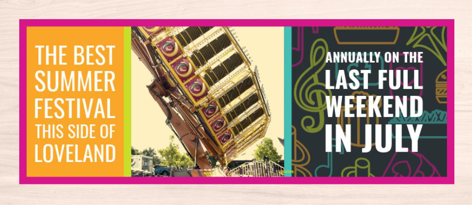
SMOY Fest is the largest fundraiser for St. Margaret of York held annually each Summer during the last weekend of July. The old branding had been in use for sometime and was feeling a bit stale. As part of the parish’s 40th Anniversary I was asked to give the brand a refresh with its own unique stand alone branding from the parish’s main brand that could be used for the next decade.
This project began about five months before the event and had three months from the start until the first promotional materials were sent out. The key challenge was to create a visual identity that could carry across all the event’s collateral seamlessly.
Development of Concept and Brainstorming
The first thing I did was list out all the assets we have preciously used in the past: logo, flyer, posters, parking passes, yard signs, etc. With all those things in mind I gathered inspiration from various community event and festival both big an small.
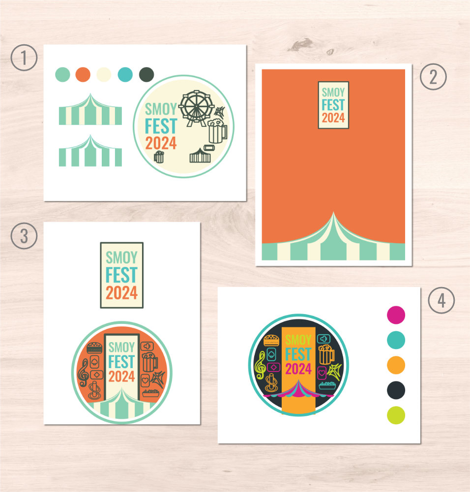
- Original concept
- Orignal Flyer concept
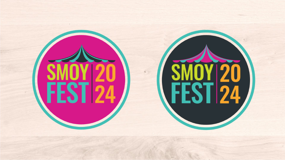
- Proposed Logo
- Color tweak after feedback
Revision of Logo and Color Pallet
The Business Manager who tasked me with the projected, gave feedback on the initial logo, which prompted the change in colors and simplification of the design. Some of the original elements were repurposed as brand assets that gave the visual identity more personality and life.
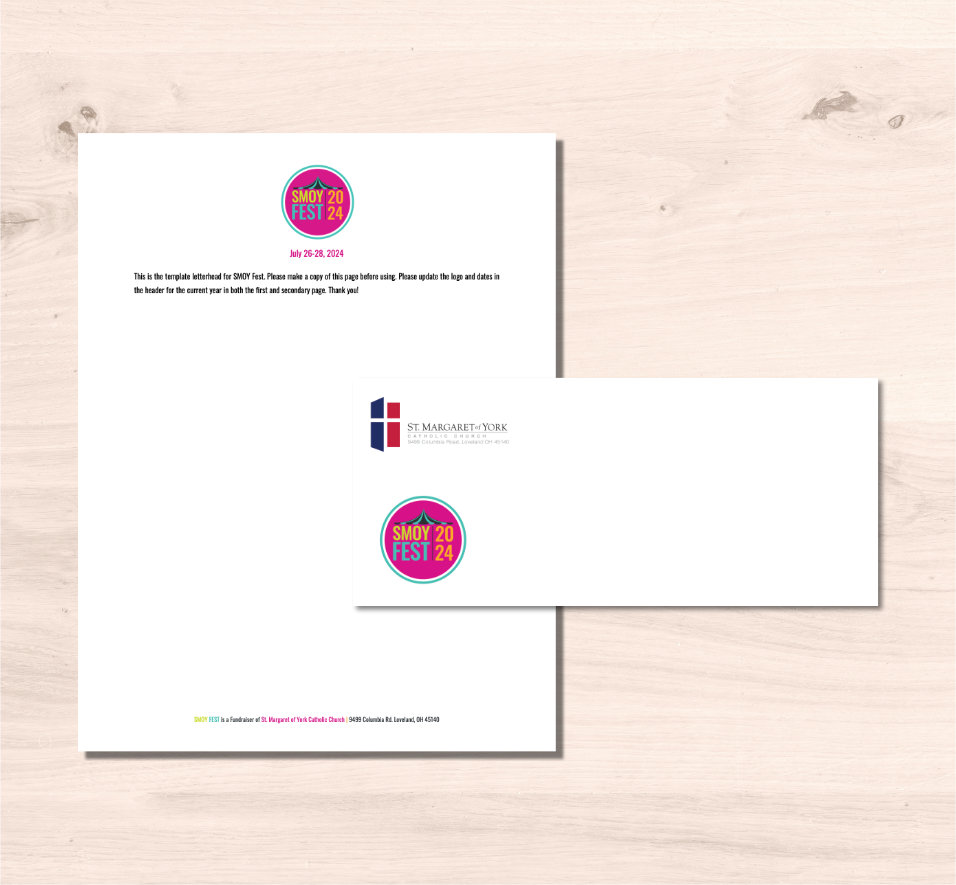
Stationary
The stationary a letterhead and an envelope are primarily used for soliciting donations and to send to past donars as well as thank yous after the event. A custom letterhead was made for the event and the envelope used the parish's main stationary with the addtion of the festival logo.
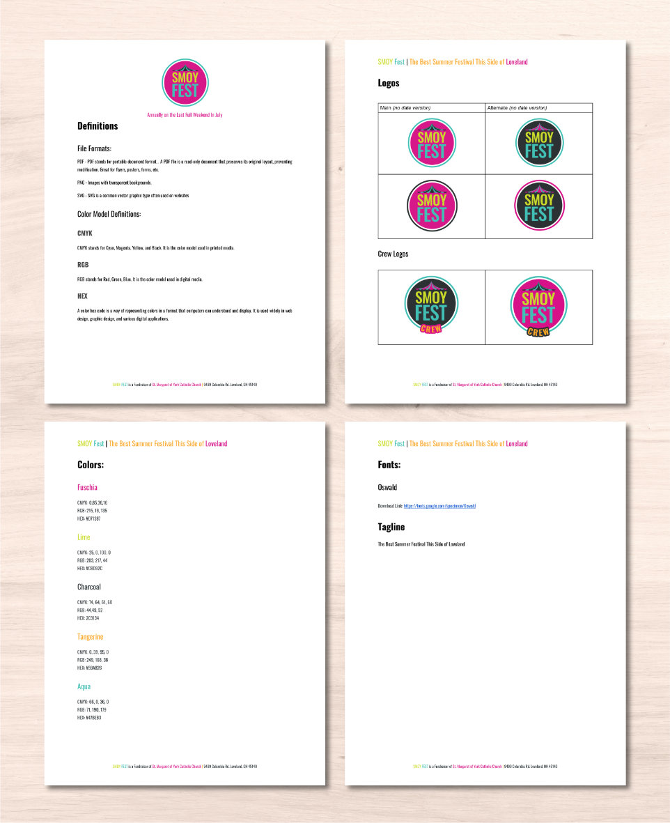
Branding Guidelines and Asset Library
As a non-profit, St. Margaret often relies on volunteers (who may not have extensive design experience), therefore I elected to build a simple, easy-to-use brand guide in Google Docs as the organization and volunteers were already using Google Workspace tools for collaboration.
Additionally, with in the shared Google Drive, I created an asset library where volunteers and staff could access logos, icons, and other collateral as needed.
Icons
The icons were originally contained into the first iteration of the logo that were removed and repurposed to enhance the overall visual story telling. The icons themselves were inspired by the imagery of Cincinnati Oktoberfest and line art.
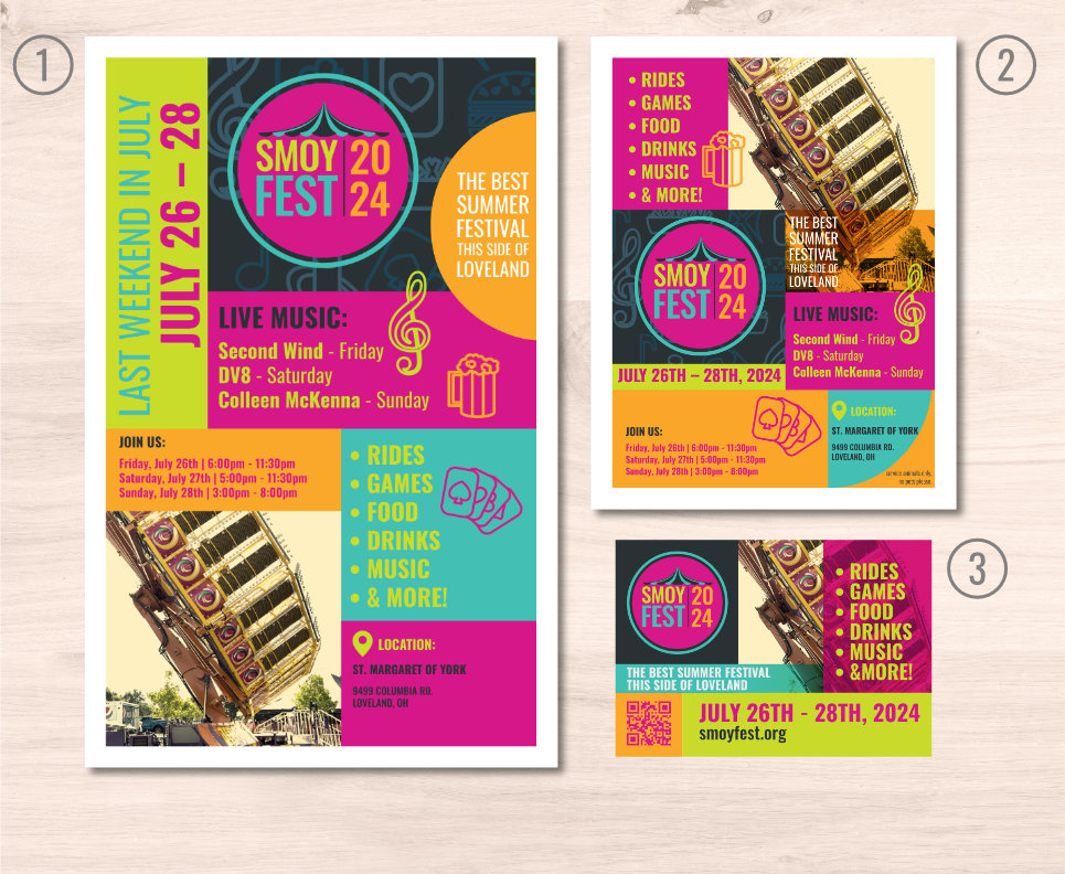
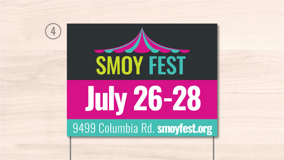
Promotional Materials
The festival was promoted physcially through flyers, mini posters, yard signs and paid advertizments as well as through socila media.
- Mini Poster (11x17in)
- Flyer (8.5x11in)
- Eighth Page Catholic Telegraph Ad
- Yard Sign (18x24in)
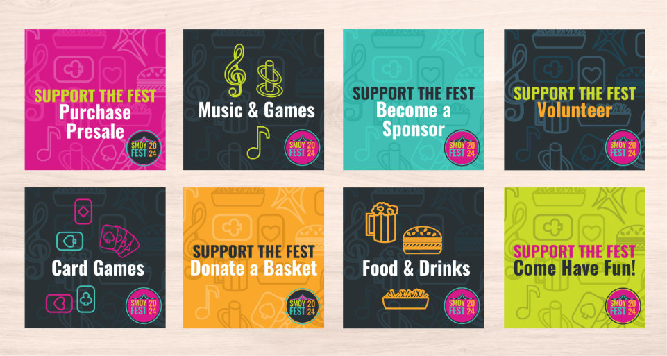
Social Media
Posts were used to solicit donations, recruit volunteers, and promote to the event to the local community.
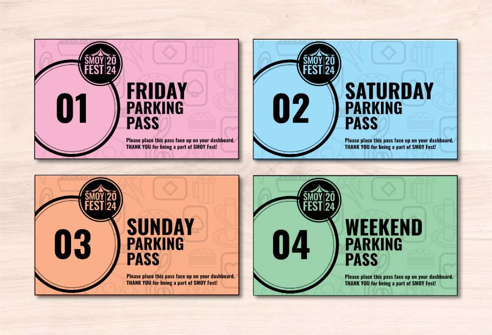
Event Parking Passes
During the event there is limited parking available for volunteers and qualifying sponsors. In the past, passes were handed off from volunteer to volunteer according to who needed one each night. Sometimes passes did not get handed off.
Refreshing the festival’s visual identity brought the opportunity to rethink the logistics of the passes. Instead of creating one pass design for the weekend to be handed off from person to person, I decided to create four different passes: Friday, Saturday, Sunday, and a pass valid for the entire weekend. Each pass was clearly labeled with the day it was valid for and the color changed for each pass type to make it easy to spot an invalid pass.
These passes matched the specifications the organization had used for years and 8 fit on a 8.5x11 sheet of paper. However it was later requested the passes be made larger for easier visibility at a distance.
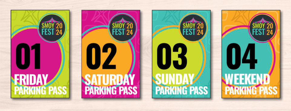
Therefore the passes were made larger to fit 2 per 8.5x 11 sheet of paper but this change required a rethink of our original idea to reduce cost of printing them. So instead of full color on cardstock, I pivoted the design to black and white printed on different colored papers we already had available in our office supplies.